

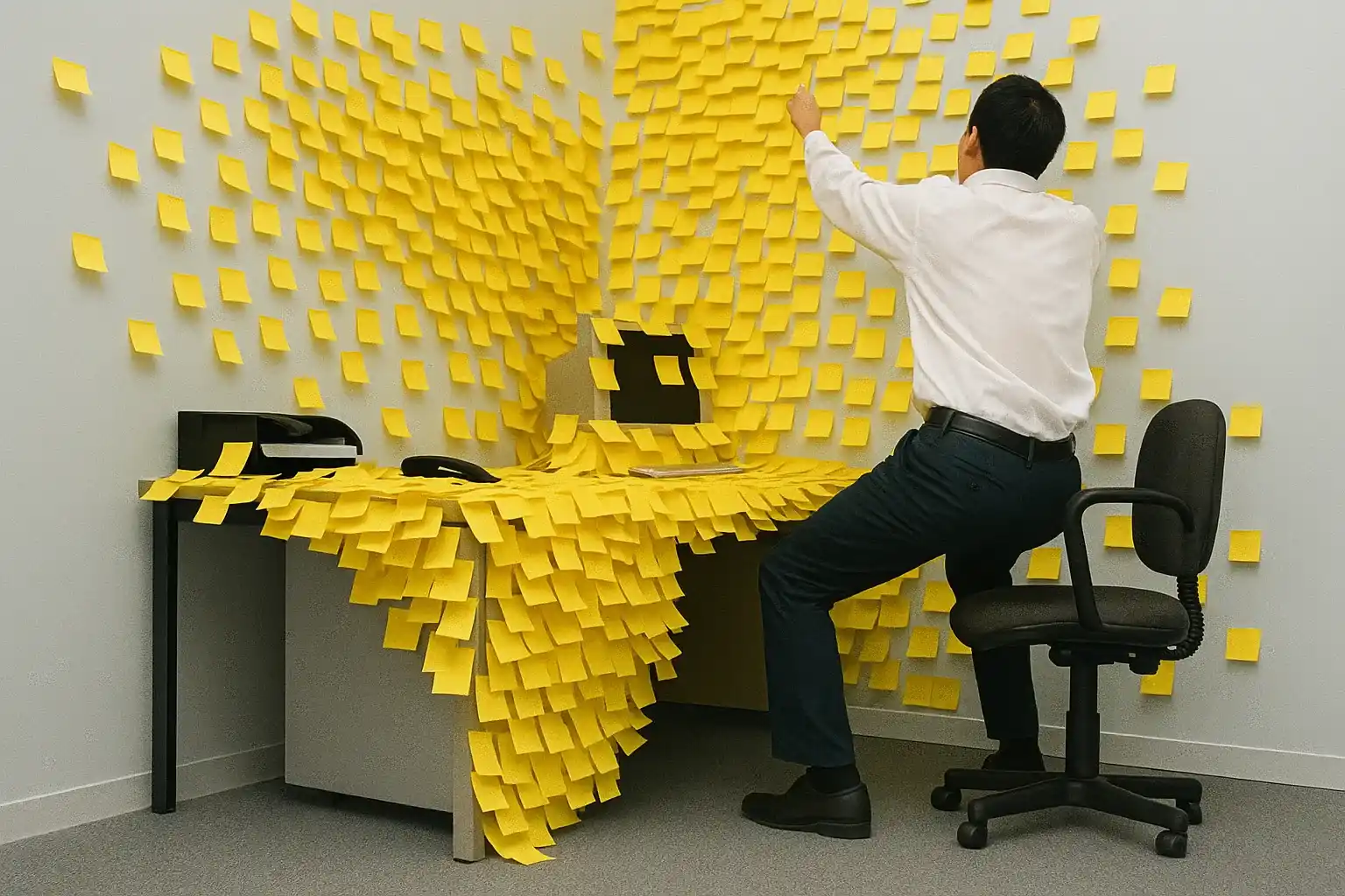
Have you ever opened your app, shrink the window and watch it go crazy, as if each element decided to do its own thing?
Controls that move on their own, elements that overlap without logic, details that you had carefully arranged that rebel as if they wanted revenge.
It's not just a technical problem, but something that hits you inside, because you worked hard and seeing everything fall apart makes you feel vulnerable and inadequate.
In those moments you don't just wonder what went wrong but you start to doubt yourself, because that silent failure digs in and makes you think you're not up to it.
But the truth is you're not wrong, you were just left alone, without concrete instructions, with powerful tools but never fully explained by someone expert.
The layout is not a graphic detail to be fixed later but the basis that supports your application and can determine its final perception.
Many developers think it's easy to deal with until they bump into it and find even a single misplaced line can cause difficult problems.
Every StackPanel used without criteria is a trap ready to spring at the first resize and every hastily configured Grid can hide an explosive disaster.
It's not just a question of aesthetics or dexterity with the mouse, but of knowing how to plan in advance, deciding consciously before dragging random controls.
The problem arises when you rely on habit, using Grid everywhere because "it's more powerful" or StackPanel always, without stopping to think if it's really right.
Both strategies sooner or later lead to fragile layouts, which collapse under pressure as soon as a condition changes or a window is enlarged on a different monitor.
Many articles inundate you with acronyms and shortcuts but none really tell you about that sense of failure you feel when the interface breaks after days of work.
The worst thing is not the visual bug but the wound it leaves, that doubt that sticks inside you and makes you think you don't have what it takes to do well.
But if today you feel frustrated, is an important signal, because only those who really care about what they build lose their temper when something breaks for no apparent reason.
This article is for you, who build with passion and feel stuck, for you who are talented but want to finally understand how to make your interface solid.
You won't find magic or textbook shortcuts but clear explanations and reasoned choices to transform the design from an attempt to a reliable process.
Why is layout critical in WPF?

There are frustrations that don't come from errors in the code, but from that bitter feeling that comes when the interface collapses on the first touch.
You've aligned every control, checked dimensions and proportions, yet all it takes is changing monitors to throw everything into crisis.
There the classic painful question arises: why does this happen even if I followed every step, even if it worked perfectly on my machine?
The answer is simple and unpleasant: no one ever told you that layout is the foundation of a good one Desktop UI composition on which the entire user experience is based.
It's not your fault if you focused more on the controls than on their location.
The layout does not give errors, does not throw exceptions, but takes revenge at the worst moment.
You can have perfect colors and flawless functionality, but if the interface doesn't adapt, the message that gets across is one of instability.
The user does not understand how a layout works, but immediately notices when something is out of place.
The layout communicates without words, but with a disarming clarity: it is the harmony of the proportions that generates a sensation of order and stability that is perceived at a glance.
A fragile layout costs more than you imagine, in time, reputation and trust.
Your user doesn't see the code, but he perceives everything through what he sees.
When something is shaky, start doubting the rest of your work too.
A window that deforms communicates superficiality more than a thousand bugs, while one that resists every variation becomes proof of professionalism.
The WPF technology it gives you enormous freedom, but that freedom must be managed with vision, with method, with the humility to plan before placing the first control.
Grid vs StackPanel: which one to choose for your project

It often happens that you find yourself faced with an interface to design and If in doubt, choose the first container which seems to work.
At first everything seems to go smoothly, but as soon as you start testing or simulating on other devices, something breaks leaving a mess.
And that's where you ask yourself, "Did I choose the right container or I just put a patch temporary?".
The point is that no one has ever seriously explained to you when to use Grid and when StackPanel is the correct choice.
They only tell you that "they are used to arrange elements", but that is not enough to make informed decisions.
Grid is like a meticulous architect who asks you to think in rows and columns, forces you to be precise but offers you stability.
StackPanel is more forgiving, saving you time when the interface is simple, but it can turn into a treacherous obstacle.
The problem is not choosing badly, but choose without understanding what that choice entails in the long term.
Many developers fall into the trap of "it works now", but the layout must hold up over time, changes, unpredictable conditions.
Grid and StackPanel are not two variations of the same concept but tools designed for completely opposite purposes.
The temptation is to use StackPanel for simplicity, but when the UI grows that choice turns into a structural limit that is difficult to overcome.
To decide clearly, follow these criteria:
- Use Grid when you need precise control about rows, columns, proportions and adaptive behavior in dynamic contexts
- Use StackPanel when ordering is simple, linear and must not react to changes in space or content
- Avoid StackPanel in complex layouts: fails when dynamic changes or complex interactions begin
- Avoid Grids for very simple layouts: introduces unnecessary complexity that slows development and maintenance
If, however, you just need to arrange elements in a row, without complex adjustments, StackPanel helps you save time without unnecessary complications.
But you always have to ask yourself, “Will this UI change over time,” because if the answer is yes, you can't afford a comfortable choice now.
There are no strict rules, but your ability to imagine exists the behavior of the interface in the most uncomfortable contexts.
When you learn to distinguish contexts, you stop improvising and start choosing calmly, with criteria, knowing that behind every container there is a design responsibility.
How many times have you chosen Grid or StackPanel "because it seemed more secure" without knowing if it was really the right choice?
The difference between those who develop fragile interfaces and those who create layouts that last over time lies not in technical knowledge, but in the strategy of the approach.
Ours WPF course offers you a structured path that transform the way you think about layout, eliminating doubts and random choices forever.
Do you want to find out how to access this route?
Leave us your details and we will contact you to explain how our advanced training system works.
In a short call we will show you what you could achieve and how this would change the way you develop.
Create flexible layouts with Grid

Have you ever felt that feeling of not know where to put things, like when you furnish a room and every move alters the balance.
It's the same chaos you feel when you build an interface and every element seems to fight to find its right place.
Yet, it exists a way to bring order only once, which does not chain but structures, which does not stiffen but guides with logic.
This mode is called Grid, and should not be seen as a rigid cage but as a living map, designed to offer proportion and precision.
Grid is not just a container with rows and columns, it is a way of thinking, an approach that forces you to think in terms of relationships.
Instead of laying out controls one after another, you start asking yourself what needs to stay fixed, what needs to adapt, what grows with space.
Each row and column can behave differently: proportional, automatic or fixed, and each component knows exactly where to be.
This order arises from a clear mental map, from a vision that anticipates problems before they show up.
The secret lies not in the code but in the preparation: pen and paper before mouse and markup.
View the structure helps you understand what you need to the user and what is superfluous.
Identify the fundamental areas: fixed header for stable contents, flexible central body, sidebar for commands, footer for states.
Each area has different priorities as space gets smaller, and you have to decide what to sacrifice to keep the experience consistent.
The definitions of rows and columns they become bricks of an invisible but powerful architecture.
Each definition has a specific behavior that determines how the area reacts to changes in size and content:
- Auto fits perfectly with the content: the row or column grows only as much as necessary to contain the internal elements without wasting precious space
- Star takes up all the remaining space: expands proportionally to fill the available area, dynamically adapting to changes in the window
- Pixel fixed size immutable: guarantees absolute stability for elements that must always maintain the same proportions regardless of the context
This intelligent combination of behaviors allows you to create interfaces that adapt without losing control.
StackPanel makes it easy to organize on the fly
At certain moments you feel the need for something that works immediately, without calculations, proportions or complex planning.
In those moments, StackPanel comes as a breath of fresh air: simple, direct, immediate, it arranges elements in a row without worries.
And do you know what its main strength is?
He doesn't ask you anything complex, but it gives you something that works the first time.
If you have a column of buttons, a vertical menu, a panel with a few elements that follow a clear order, StackPanel is the most effective answer.
StackPanel shines in specific contexts where simplicity is more important than advanced flexibility:
- Login and registration form: Vertical fields in a logical sequence that the user fills in from top to bottom without unnecessary distractions or complexity
- Horizontal toolbars: buttons aligned in a row that always maintain the same order and the same relative proportions between them
- Simple menus and lists: Elements that follow a clear hierarchy and do not require dynamic adaptation or complex scaling during use
You don't have to think about rows and columns, you don't have to set complex proportions: you set orientation and add elements in a natural sequence.
The time savings are real: write less code, make fewer mistakes, you get something usable and consistent right away.
But precisely in this disarming simplicity lies the greatest danger: used out of context, it becomes a silent trap.
On small screens or with long content, it can make elements disappear beyond the edges without scrolling, leaving the user confused.
Its limitation is structural: it does not handle complex overflows nor adapt to dynamic changes in screen conditions.
A window built only with StackPanel is a recipe for future problems that are difficult to solve without rewriting everything.
The key is strategy: it should be used with awareness, for specific sections, never as a global structure of the interface.
The smartest solution?
Combine: StackPanel inside Grid, to combine local simplicity with global control.
Every tool in its place, for the right purpose: StackPanel excels where lightness is value, but falls apart with dynamic interfaces that require advanced adaptability.
Have you ever wondered why some developers they never seem to have any layout issues?
It's not a question of talent or years of experience: it's a question of method.
While most developers proceed by trial and error, those who work without stress follow a precise system that eliminates errors at the root and turns every project into a predictable success.
What would change in your work if you also had access to this system?
Fill out the form below and book a free call with one of our consultants.
We'll explain how our training path works and how it could revolutionize your approach to UI development.
Use columns and rows for precise positioning

Sometimes interfaces that seem perfect from a distance, as soon as you step into them you understand that something doesn't add up, as if everything had been positioned "more or less" in the right place.
Often it is the fault of haste, other times the fear of complicating one's life, and so we end up arranging the controls "by eye", hoping that they will remain there even when something changes.
Then comes the time when something breaks, moves or disappears, and you find yourself chasing mistakes, incorrect alignments and unexpected overlaps.
In those moments you understand that the only way to stop chasing the layout is to take control, and the only way to do that is to learn to use columns and rows methodically.
Grid divides the space into functional zones with a precise purpose: each element knows where to go, how to behave, and does so based on clear and stable mathematical rules.
Rows and columns are not just visual divisions, they are explicit coordinates that give order to the interface, guide the user's gaze and prevent any interpretative ambiguity.
A well-designed Grid is an invisible map that offers proportion, stability and coherence: each area has its function and each control follows a precise structural logic.
Each column can represent a functional section, each row can define a logical area, and together they create a visual hierarchy that helps the user orient himself effortlessly.
When everything is in the right place, the interface it stops looking like it's made up of pieces and begins to communicate coherence, intention and professional care even in the smallest details.
The real strength lies in predictability: you know what will happen when the window changes, you know which areas will expand, which will stay still, and you decide it before it happens.
Lines can be Auto, Star or Fixed:
- Auto adapts to content,
- Star uses all available space,
- Pixels are immutable for precise and non-negotiable needs.
Same logic for columns: a sidebar can remain fixed with size in pixels, while the content area expands using Star for adapt to every possible context.
You can span controls across multiple cells to create continuous bands like headers or footers that visually unify the interface without sacrificing clarity or usability.
Every decision made has consequences: the layout holds up not only because it is beautiful but because it is designed with a logic that anticipates change and governs it with balance.
A well-constructed grid doesn't force you to manually reposition every element, because every control follows stable rules which do not require continuous adjustments.
When you reduce the window and everything remains harmonious, you understand that the structure is doing its job, that the UI is solid and that you can concentrate on other things without fearing surprises.
Margins and padding for harmonious design

There are interfaces that seem tidy and complete, but they convey a strange feeling of unease Visual: Have you ever felt that subtle feeling of stiffness?
You look at a UI and it seems like every element is poorly placed.
Yet, it is often not the fault of the structure, nor of the content, but of the space that surrounds each element.
Margins and padding are the real culprits of that discomfort that the eye perceives but cannot explain rationally.
The margin is the external space that separates a control from the others, the padding is the internal space that protects the content.
These two values, if well calibrated, they transform any layout into a UI which conveys balance and visual comfort.
Margin and padding are the breath of the interface: they give controls the space to exist, be read and be understood.
A button too close to another generates tension, a label without padding seems compressed and awkward.
A control without margin invades the visual space and generates confusion that the brain immediately perceives.
Even the most solid structure appears chaotic if the spaces are unbalanced, e.g the user feels it without knowing why.
The point is not to add random spaces, but to train the gaze: observe where the eye gets tired, where it relaxes.
Each element needs a minimum space to be noticed and a maximum space to not isolate itself from the context.
Your skill lies in measuring these intervals with visual coherence, without random distances.
Follow these principles for harmonious spaces:
- Choose a base value and build everything around that to maintain visual consistency throughout the application
- Use harmonic multiples like 4, 8, 12, 16, 20 which are the foundation of any good professional spacing system
- Head by reducing the window: if the spaces hold up, readability and interaction will also hold up without problems
- Visually hear your work: when a screen "doesn't fit", first act on margins and padding
Coherence in spaces is like silent grammar: the more precise it is, the more it goes unnoticed, the more it makes the interface understandable.
Responsive design in WPF: adapt the interface to each screen
Few things are as uncomfortable as seeing your interface not adapt to a different device, as if all the design only makes sense on your monitor.
You've tested everything, you've worked carefully, but as soon as you launch the app on a laptop or on a 4K screen something breaks, moves, shrinks leaving you with a feeling of helplessness.
It's as if your UI were too short a blanket: you pull one side and uncover the other, you try to fix one part and compromise another, in an endless game of compromises.
The truth is that responsive design is not a web fad, it is a universal principle for all modern interfaces, especially in WPF where every window is resizable.
Even on the desktop, adaptability is crucial, because apps run on huge monitors, thin laptops, vertical tablets, and the user expects everything to always work without breaking.
The first mistake is thinking that responsive just means "shrink": It actually means deciding how a layout changes, what fits, and when something can be hidden.
You have to start thinking in terms of visual behavior, not just size: what needs to remain visible, what can disappear, what can fit without losing clarity.
WPF puts precise and powerful tools in your hands, but if you don't follow a design vision, every choice becomes a potential mistake.
A layout cannot grow infinitely nor shrink without limits: defining the minimum and maximum dimensions is essential ensure legible proportions and constant usability.
A column that is too wide makes the text difficult to read, a fixed sidebar can invade the main space on small screens, the proportions must be adjusted carefully.
Responsive does not mean "I let everything fit everywhere", but "I choose what to show best in each context", and sometimes it is better to hide rather than force everything into a small space.
Build your UI like water: capable of adapting to any container, but always coherent, fluid and understandable in every form, on every device, in every condition.
Don't ask yourself "how do I fit everything in", ask yourself "what is really needed here and now", this is the key question for every responsive interface, and it is also the most difficult one.
To verify that your responsive design really works in every situation, follow this methodical testing process:
- Test on extreme resolutions
- Simulate drastic scaling
- Check with variable contents
A well-thought-out layout is a promise you keep everywhere: whether the user uses a large or small screen, the interaction must always remain simple and harmonious.
What separates those who develop from those who work with confidence is the mastery of principles that go beyond the single technology.
There is a path that takes you from "I hope it works" to "I know it will work", transforming every project into a certainty, rather than a gamble.
Are you ready to find out how this path works?
Leave your contact details below: we will call you to arrange a short free conversation where we will explain in detail how our training system could transform the way you approach UI development forever.
Common layout management mistakes and how to avoid them

Some errors do not give obvious signals, they do not block execution, they do not show exceptions, but they follow you everywhere making the UI fragile and unpredictable in daily behavior.
Have you ever spent hours figuring out why a button moves only under certain conditions, or because a column collapses as soon as the content changes without giving logical explanations.
These are not real bugs, but the result of choices made quickly, often out of habit or laziness, choices that work in the short term but collapse as soon as something goes out of the box.
The most subtle mistake is to always use the same container, as if Grid or StackPanel were automatically interchangeable, choosing them without real need functional.
Grid everywhere "because it's more powerful", StackPanel everywhere "because it's faster": two extremes that seem opposite but lead to the same disastrous result in the long term.
The second frequent mistake is to block everything with a fixed size, thinking that this way "nothing moves", but forgetting that we live in a world where every screen is different.
A layout made with absolute widths is like a house built on sand: apparently stable, but just a small change and everything starts to give way where you don't expect it.
The minimum and maximum dimensions are the true instrument of stability: they allow you to adapt elegantly without ever exceeding the critical limits that compromise readability.
Then there is the blind copy-paste from one project to another, a habit that was born to save time but which often multiplies the problems hidden ones that return when you least expect it.
Each interface has unique needs, each context requires specific solutions, and no layout should be reused without first asking yourself: "is this really what is needed here".
Another serious mistake is ignoring margins and padding, or using them inconsistently, leaving random spaces that create visual tension even if you can't explain why.
The human eye perceives disharmonies even without understanding where they come from, and a UI that conveys visual clutter will always be perceived as technically unreliable.
Not testing across multiple resolutions is a dangerous form of design myopia that costs dearly in the long term, because the user doesn't have your screen, your DPI, your way of interacting.
Always check how the interface reacts to small sizes, enlarged fonts, unusual configurations, why only then can you anticipate problems which otherwise will emerge too late.
Using absolute positioning to avoid thinking about structure is another common mistake: it works at first but forces you to manually correct any future changes.
An effective layout adapts itself, it should not be managed pixel by pixel, the structure does the work for you if you let it, but you have to design it with intention and not with shortcuts.
And finally, the most invisible of all: designing only for yourself, forgetting accessibility, ergonomics, the variety of users who have to use your app in real conditions.
Recognizing these mistakes does not mean being perfect, it means becoming aware, it means building solidly, thinking about the future, before the future forces you to do everything again.
True mastery lies not in using just one tool, but in intelligently combining Grid and StackPanel to achieve superior, longer-lasting results.
Many developers think they have to choose one or the other, but the best solution is often a hybrid and strategic one, designed to leverage the strengths of both approaches.
Practical examples of layouts with Grid and StackPanel

Theory comes to life when you see applications that they transform problematic interfaces into elegant solutions, showing how each design choice solves specific problems.
Imagine a management application with a list on the left and details on the right that need to fit together while always maintaining readable and functional proportions.
Grid with two columns, the first that adapts to the content for the list, the second that expands for the details: by resizing, everything remains harmonious and proportionate.
But what if the list is empty?
A minimum width on the first column prevents it from disappearing completely, maintaining visual coherence even in extreme situations.
An editor requires a toolbar at the top, a work area in the center, information at the bottom: three well-defined lines, the central one taking up all the available space.
The toolbar fits the buttons, the information remains fixed to remain readable, the main area expands to give maximum work space to the user.
To group buttons in the toolbar, simple containers create logical sections separated by visual dividers that help the user quickly orient themselves.
A long registration form needs scrolling to don't leave the screen, but the header and main actions must always remain visible and accessible.
Three-level structure: fixed header, scrollable area with the form in the central part that expands, fixed action section for the main buttons.
Inside the scrollable area, another grid organizes the fields into two columns: labels that fit the content on the left, controls that expand on the right.
A dashboard with resizable elements uses grids with dividers: user can adjust aspect ratio according to your preferences and daily work habits.
Each internal element is independent, it can be a simple container or a complex structure depending on the type of content it must show to the user.
A guided assistant has navigation at the top, variable content in the middle, and fixed buttons at the bottom – a structure that remains stable while the content changes completely.
The central content transforms between steps, but the grid ensures that navigation and actions always maintain consistent and predictable positions for the user.
These examples show how each design choice solves specific problems and creates concrete value for those who use the application, transforming complexity into ease of use.
An often overlooked aspect is the impact of layout choices on application performance, because not all containers are created equal in terms of efficiency.
Some require more calculations, others are more efficient but less flexible, and the right choice depends on the specific context and the real needs of the project.
Complex grids can slow down the display, especially if resized frequently, while simple containers are fast but limited in their ability to adapt.
Virtualization becomes crucial for long lists: only visible elements are processed to maintain fluidity, but it only works with containers that support it natively.
Each level of nested containers adds complexity: avoid structures within structures with no specific functional reason, keep it simple where possible.
The trick is to balance flexibility and performance: use complexity only where you really need it, keep direct approaches where advanced features are not needed.
Always test the application under stress: many users, multiple windows, frequent resizing to verify that everything holds up even under the most demanding conditions.
When something goes wrong in your layout, debugging can become a nightmare if you don't know the right tools to understand what's going on behind the scenes.
Development environments provide excellent tools for exploring the visual structure and seeing properties in real time as the application runs.
Making the boundaries of the cells visible is the first ally: it allows you to immediately understand where the problems are and how the structure behaves in different situations.
Temporary colored backgrounds on containers help you visualize the actual footprint of each item and understand why something doesn't fit as expected.
When a control disappears, it's often outside the confines of the container: always check its actual size and properties to understand what's really happening.
Patience is key: Layout issues they rarely have obvious causes, but they are always logical once understood, and each solution teaches you something for the future.
Now enough with the excuses!
Did you just read about five thousand words about WPF layouts and know what's going to happen tomorrow?
You will open Visual Studio, e you will make exactly the same mistakes ever.
You'll use Grid randomly, you'll put StackPanel everywhere, your interface will collapse at the first resize and you'll be back online looking for patches.
Why?
Why believe that an article makes you a better developer it is a dangerous fantasy; it's the most comfortable lie you tell yourself every day
Do you know what the truth is that bothers you?
Ninety percent of the WPF developers I know have read dozens of articles like this, know the theory and technical details inside out.
Yet, he continues to write interfaces that break in production, leaving users frustrated and managers upset every single day.
It's not your fault.
They sell you content, not skills.
Result?
You are always at the mercy of the next problem, the next emergency.
You have two ways to make a choice:
- Scenario A: You read, you feel prepared, you develop, something breaks, you search on Google, patch it up, repeat endlessly.
- Scenario B: You learn a system, you always apply it, it always works, you grow without stress, you become the team's reference.
In the first case you solve problems, in the second you prevent them.
The difference is abysmal it changes your entire career path.
Now my proposal.
I don't sell miracle courses or magic tricks, but I propose a paradigm shift.
Leave your details, we will contact you as soon as possible to arrange a call with one of my consultants, where he will show you exactly what it takes to go from "I hope" to "I know".
Warning: this call is not for those who:
- Look for magical shortcuts that promise immediate results without effort, as if there were secret formulas for success
- He is not willing to question methods consolidated over the years, even if they clearly do not work in everyday reality
- He thinks that "it works like this anyway" and sees no problems in his current development methodologies, which are completely wrong
- He believes that ten years of experience means competence, when often it is a year repeated ten times without evolution
Book it now!
If you've made it this far, it's because something inside you wants to change.
But reading is not enough, taking action is what really transforms you.
I receive dozens of requests every week, but I can only talk to those who are truly motivated to grow, not those who just want confirmation.
This page will close and if you start using Grid and StackPanel randomly again, at least now you know you won't be able to say you didn't know.
The call is free, but the price of staying still you're already paying for it every day: credibility, time, opportunities worth thousands of euros.
The equation is simple, the choice is not.
Do the right one.
Leave your details in the form below