

Today there is no longer a single screen or a single dimension: each user connects from different contexts, often on the move, with little time available and ever higher expectations about what lives online.
If your site doesn't adapt well to every type of screen, you're already losing users before they even have time to read a single word of it.
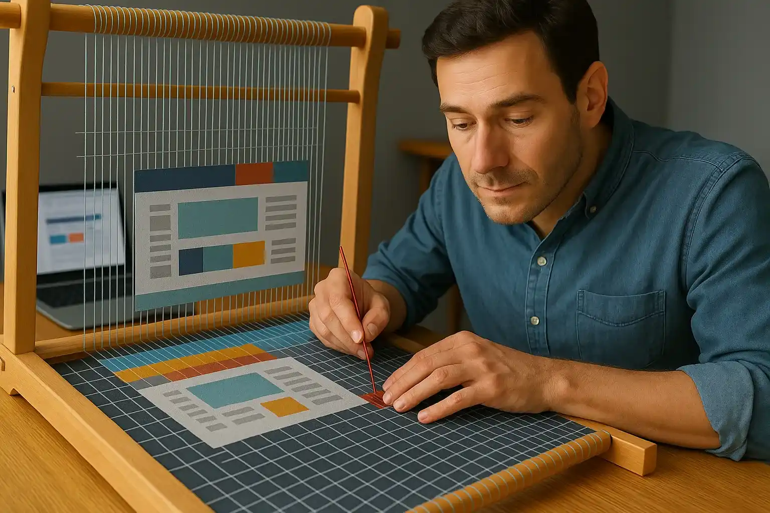
Responsive design isn't a feature to show off in your portfolio, it's yours entrance ticket in the real world of digital design.
Being present on mobile and desktop does not mean duplicating content but imagining experiences that transform based on the context while respecting the user's attention and intentions.
Every layout choice, every image and every block of text must answer a single essential question: “how can I simplify your life Who is browsing at this very moment?”
In this guide I will take you through the fundamentals of responsive design with clear language and a concrete approach based on direct experience and not on abstract formulas.
You will learn to build interfaces which adapt fluidly to every screen and respond naturally to the gestures and habits of those who actually use them.
If you too feel the need to overcome improvised solutions and return to building with order, clarity and control then this is it the real starting point that you were looking for.
Responsive design: what it really is and why it is indispensable today

A responsive site does not reduce content but rearranges them based on available space, maintaining visual clarity and reading fluidity on every device possible.
User behavior has changed: today we no longer design for a single resolution, but for a set of situations in which every detail must adapt without losing coherence or functionality, because it only takes a moment to lose the attention of the visitor.
An unresponsive site today is perceived as slow, obsolete and poorly maintained even if the content is good because the visual experience is the first to speak to those who are watching.
Being responsive means prevent user irritation who can't read well or click a button because every obstacle is a possible escape from your content.
It is the ability to read the context of those in front of you, with tools and expectations different from those imagined, and respond with clarity, simplicity and empathy, respecting every second of their attention.
A good responsive design puts UX at the center, not the code.
Anyone who connects from a smartphone doesn't want less information but one smarter presentation that guides him without friction towards what he is looking for.
In an era where user experience matters more than the perfect layout, adapting your site to each screen is a gesture of care and awareness that you can no longer put off.
When we start designing responsive websites, the first mistake is think it's just about "fitting in" a layout.
In reality, it is a form of language, a visual code that communicates attention and intelligence.
To really understand it, we must start from its roots, not from a framework, not from a library; but from the why.
The basic principles: Media Queries and Flexbox

Media Queries allow you to respond dynamically to the width of the screen, adapting the style of the site in real time to improve readability and interaction.
Flexbox on the other hand allows you to arrange the elements on a line or a column, managing spaces intelligently without resorting to rigid calculations or complex structures.
The combined use of Media Queries and Flexbox ti allows you to build interfaces that change fluidly following the needs of each device without ever breaking.
A good Media Query does not impose fixed rules but accompanies the transformation of the screen by adapting the visual hierarchy and the order of the elements to encourage attention.
Flexbox allows you to align contents horizontally or vertically, letting the available dimensions determine the most harmonious arrangement.
It's not about writing code but about imagine a behavior before you even start designing knowing that nothing will remain static even for a second.
Each section of your site should be able to live in multiple configurations without losing meaning or beauty, adapting like water to each container that hosts it.
When you start thinking responsively, Media Queries are no longer exceptions but become the natural way to build content that really breathes.
You've started to see first-hand how powerful responsive design is, but the real leap comes when you no longer limit yourself to copying snippets or following tutorials.
If you want to really master the basics like Flexbox and Media Queries, it's time to make them yours.
It's not enough to make a layout work, you have to understand it, shape it, adapt it intelligently to every real context.
This is the first step towards true creative freedom on the front end.
Label CTA (first person):
I want to really master Flexbox and Media Queries, not half use them
But a base, to be truly solid, needs structure.
And the structure, in responsive design, comes to life through systems that do not simply position, but manage spaces, weights and priorities.
This is where the two tools that change the visual rhythm of every interface come into play: Grid and Flexbox.
Building fluid layouts with Grid and Flexbox: the real thing responsive design architecture

The difference between a rigid layout and a fluid one is the same as between a closed container and a living one that grows and adapts without ever losing its visual identity.
Flexbox allows you to manage rows and columns with precision but it is with CSS Grid that you achieve maximum flexibility organizing complex spaces without burdening the code.
With Grid you can define modular structures that they adapt automatically to the number of elements present, distributing the content in a balanced and always readable way.
You no longer have to fear complex grids because you create patterns that respond to context and transform in real time while maintaining elegance and geometric precision.
The combination of Flexbox and Grid gives you the complete control because you can use them as needed by alternating them to manage micro-layouts or entire independent sections.
A fluid layout is not only proportionate but is also aware of the content it hosts and enhances it by moving it to the right place without forcing or unnecessary repetitions.
The real challenge is not to distribute elements but create a coherent visual rhythm that accompanies the eye and helps the user orient themselves without ever feeling overwhelmed or disoriented.
Every page that works well is the result of careful design to breathe the layout that expands and contracts like a digital skin tailored to the reader.
Adapt images and media for optimal viewing

A site can look great at first glance, but still fail if the visual content doesn't scale well to smaller screens, causing slowness, awkward clipping, or misplaced elements.
No one should have to wait for an image or see a cut video: the user deserves immediate clarity, always and everywhere.
Each image should adapt to the context in which it is displayed, taking into account the device and connection, so as to offer a fluid experience and show only what is really needed.
Video, audio and other complex elements they must adapt to the available space using fluid proportions and flexible containers, to integrate into the layout without forcing or broken margins.
To make the behavior of visual content more effective, there are some practical steps to follow:
- Adjust images so that they never exceed the available space.
- Show different versions based on the device without weighing down the page.
- Reduce the weight of images maintaining its visual quality.
- Avoid rigid media elements, which do not adapt to different formats.
Every visual content must be considered an integral part of the experience, not as a simple decoration, because it directly affects the perception of quality.
Well-designed content must not only change shape but maintain meaning and visual balance in any situation.
An image that is out of scale or a video that is too large can compromise the experience and cause abandonments: this is why it is essential to evaluate the weight of the contents already in the planning phase, to guarantee speed and visibility.
Choose optimized formats that maintain good visual performance without overloading the page, especially on high-resolution devices.
Avoid rigid visual materials, designed without considering the environment in which they will be displayed, and prefer flexible solutions that adapt continuously.
Remember that every visual content must convey a clear message or a concrete emotionotherwise it just becomes a burden that disturbs those seeking order and immediacy.
Don't forget accessibility: always offer understandable alternatives to visual content and integrates messages into the text, so as to guarantee an effective experience even in the absence of visual support.
A fast site doesn't arise by chance.
Every image, every video, every media must live in harmony with the screen, the context and the user's connection.
And if today you still rely on heavy files or broken layouts, know that you are sabotaging your own project.
But even the fastest and most well-optimized project can collapse at the first real impact if it is not tested in the right contexts.
Responsive websites are not judged at the table, they are measured in the field, where UX clashes with distracted fingers, unstable networks and unpredictable habits.
This is why testing becomes the true test of every design choice.
Discover now how to transform visual contents into allies of your design, optimizing them with intelligence and precision, without ever sacrificing quality.
Testing for mobile and desktop devices

Designing well is not enough if you don't test what you've built in concrete situations, because no simulation can truly replicate real conditions of use.
Tests should starting from the most common devices, where direct interaction and movement change the way we read and perceive each content.
Check if each element is fast, readable and stable even in less than ideal conditions, because a good test reveals weak points, not confirms what already works.
Try different screen combinations, orientation and settings because only in this way can you guarantee consistency, stability and clarity in every possible context.
To improve the effectiveness of your tests, consider these key elements:
- Evaluate whether everything responds good to the touch and if the interaction is immediate.
- Check readability in different light and color conditions.
- Check the fluidity of the experience even in the presence of slowdowns.
- Try switching views to see if everything remains consistent.
A truly responsive site maintains clarity and solidity even where you don't control it, showing its value in the most unpredictable contexts.
Testing is a strategic choice, not a technical detail: it is what separates a site that reassures from one that disorientates, and if you don't test, the user will without giving you a second chance.
Simulate different and difficult contexts to avoid the user having to report problems that could have emerged before.
Note any anomalous behavior to intervene promptly and improve stability and reliability over time.
Testing must be continuous, not just finals, because every change can alter the balance achieved and what works today may not hold up tomorrow.
Evaluate how the user interacts with all the most dynamic elements and make sure they are accessible from every point of view, in every type of situation.
Only with method and attention to detail can you build a solid structure that resists even unexpected uses or extraordinary conditions.
Advanced techniques for creating responsive sites

Beyond the essential aspects, there are design choices that really make the difference, such as flexible structures and relative proportions that maintain coherence even when size or context varies.
Improve readability even in tight spaces using flexible layouts and solutions that adapt the text naturally, avoiding forcing or visual changes between sections.
Concentrate first about what really matters and build each part progressively, with lightness and precision: it is often well-managed simplicity that makes what initially seemed complex flow.
Don't design just for the screen: think about the user's behavior, knowing that each person interprets the interface differently and what is obvious to you may be unclear.
Even starting from essential tools, you can use modern solutions to build dynamic, lightweight experiences that adapt naturally to every screen, improving clarity and efficiency.
Use solutions that allow you to change the style based on context or user preferences without having to write everything from scratch.
Also consider how to make the steps visual smoother and less intrusive, especially on devices with less graphics power.
Organize the structure of the site well to facilitate not only the visual aspect but also the understanding by the engines and accessibility tools.
Offer simple and automatic alternative versions to respect both visual preferences and technical limitations, without complicating the structure or multiply the work.
Make the transition from one device to another seamless, without visual jerks or changes that force the user to readjust each time.
Those who stop at the margins of responsive design risk always remaining dependent on other people's libraries.
But those who delve into the heart of advanced techniques discover a new level of control.
Layouts that adapt themselves, animations that move only when needed, aspect ratios that change gracefully.
If you're ready to step out of the comfort zone and really write code that surprises, then start here.
It's the difference between those who copy and those who create.
But even the most refined code can fail if it weighs too much to get to its destination.
In responsive design, every millisecond counts, and not just for search engines, but for the dignity of the user experience.
Speed is not just technique: it is perception, confidence, comfort.
Optimizing performance in responsive design: performance and UX at the center
A reactive design loses its effectiveness if it takes too long to load, because today every second makes a difference and those who browse expect immediate responses, without tolerating waiting or hesitations.
Making a site fast is not just a technical question but a concrete gesture towards those who use it in difficult contexts, and always starts with simplification: less weight, fewer elements, more immediacy.
You can start by immediately improving some key aspects:
- Reduce invisible content or not essential at first glance
- Remove decorative elements that add no real value
- Lighten texts, images and interactive content
- Make it available immediately the fundamental parts
Allow devices to remember what does not need to be recharged every time for avoid wasting time and data.
It immediately shows what really matters and postpones everything else, so whoever opens the page will immediately perceive order, speed and attention to their needs.
Keep only what you really need: each additional function must be evaluated not only for what it adds, but also for the weight it introduces and the difficulties it can generate.
Regularly check how the site behaves, testing it on different devices and with tools that reveal slowdowns or hidden critical issues, often invisible from desktop.
Take advantage of systems capable of bringing content closer to the user to reduce the time needed to download each element, wherever the person browsing is.
Prefer visual content that is light but clear, avoiding formats that require more resources than what they offer in terms of experience.
Take care in the way you write and organize, keeping each part of the project essential, simple and easily interpretable to reduce waiting times and unexpected reactions.
Each element must be essential, clear and progressive: readable texts, light graphics and content distributed so that what matters arrives first and without effort.
It flows.
It includes.
Participate.
This is the power of speed.
Performance, in modern design, is not an addition or a technical detail to be fixed later: it is part of the design itself, such as the style, colors or words you choose.
Responsive design integration with frameworks like Bootstrap
Frameworks like Bootstrap offer a solid foundation for adaptive experiences, simplifying visual changes between devices and allowing you to focus on what really matters.
Its flexible sections allow stable and adaptable compositions, but for a professional result it is necessary to fully understand spaces, proportions and structural logic.
The components ready for use they can be adapted and personalized, but they must always be verified in the real context and modeled on the needs of the project.
Bootstrap is not a universal solution, but a useful support for speeding up and maintaining consistency, using tools such as conditional visibility to adapt content with order and accessibility.
To use Bootstrap wisely and consciously, keep some important aspects in mind:
- Adjust breakpoints depending on the real habits of your audience
- Apply classes only when they really improve the result
- Upload only what is necessary, leaving out the superfluous
- Insert light interactions that do not weigh on the overall experience
In contexts where multiple people or locations work, Bootstrap helps maintain consistency, but requires constant attention to prevent flexibility from turning into disorder.
Using it does not mean sacrificing originality or personality, but building on solid foundations that can be reworked according to the style you want to communicate.
Pair Bootstrap with lightweight solutions and reduce loaded components to the essentials to maintain a smooth and responsive experience.
In the end, consider Bootstrap as a starting point, not a constraint: the difference is always your ability to transform a generic structure into something unique and relevant.
Bootstrap is not a crutch, it is a powerful accelerator, but if everyone uses it the same way, no one will remember your work.
Personalize it, dominate it, make it speak with your voice
But only if you really know how to drive it.
Behind the default classes there is enormous potential to create interfaces that are coherent, fluid and totally yours.
Don't settle for "making it work": learn to customize, lighten, adapt and build components that truly speak the language of your brand.
If you want to stop looking like everyone else, this is the game changer.
But every turning point needs a first step.
Now that you have tools, logic and framework, it's time to see what happens when you start from a blank sheet of paper.
Building a responsive layout from scratch is not just a technical exercise: it is the most concrete proof of your way of thinking, designing and writing visual UX.
It's a way to test your design sensibilities and give concrete form to every responsive UX principle you've learned so far.
Practical example: create a responsive layout from scratch

Starting from scratch is the best way to really understand how it works a responsive design because it forces you to reflect first on the structure and then on the appearance.
Organize content logically and build a flexible foundation that follows a natural order and easily adapts to any type of screen, without rigid measures.
Build the experience starting from the simplest devices, gradually adding elements only when needed.
Manage texts by choosing sizes that work well everywhere, so as to always guarantee a fluid and natural reading.
Prepare images so they can adapt to the situation, loading only what is needed based on the user's screen.
Design a clear navigation system that changes shape depending on the device but always maintains its main function.
Pay attention to spaces and proportions, because on small screens too a detail out of place can hinder reading.
Insert more complex elements only after testing them on various devices, both with simulations and real tests, to ensure they integrate smoothly.
Make sure that every part of the project is coherent, fluid and understandable, also taking care of transitions to avoid slowdowns or disturbances in the experience.
It also predicts less common cases, while still offering a complete experience to those who use older or unusual tools.
Evaluate the results carefully and reduce everything that weighs you down to make the site faster and more pleasant to use.
Creating a responsive layout from scratch is an exercise that combines sensitivity, logic and ability to adapt, and is the basis for building solid experiences in any context.
You have explored every corner of responsive design, from the essential foundations to the most sophisticated techniques, breathing in the code behind the elegance and discovering that it is not just about layout but about a new way of thinking.
But reading is not enough.
Every line you encountered it was a call to action, an opportunity to leave the safe zone of pre-packaged templates and start building real experiences, designed to work everywhere, always.
The web changes every day.
But what doesn't change is the need to sites that respect the user, that adapt effortlessly, that speak every visual language naturally and precisely.
Now comes the moment that separates those who read from those who create, those who inform themselves from those who expose themselves.
You can close here and continue fixing everything as you always have.
Or you can decide that every interface you will write communicate your intention from the first glance, its logic and the vision that generated it.
If you feel that the time has come to make a qualitative leap, if you want to stop adapting and start really designing, then take everything you have learned with you.
Apply it with awareness, with courage, with the desire to stand out.
Your next project it may be what gets you noticed.
The one that opens the right doors for you.
The one that shows how much you are really worth.
But only if you're ready to change the way you design.
Forever.
Leave your details in the form below