

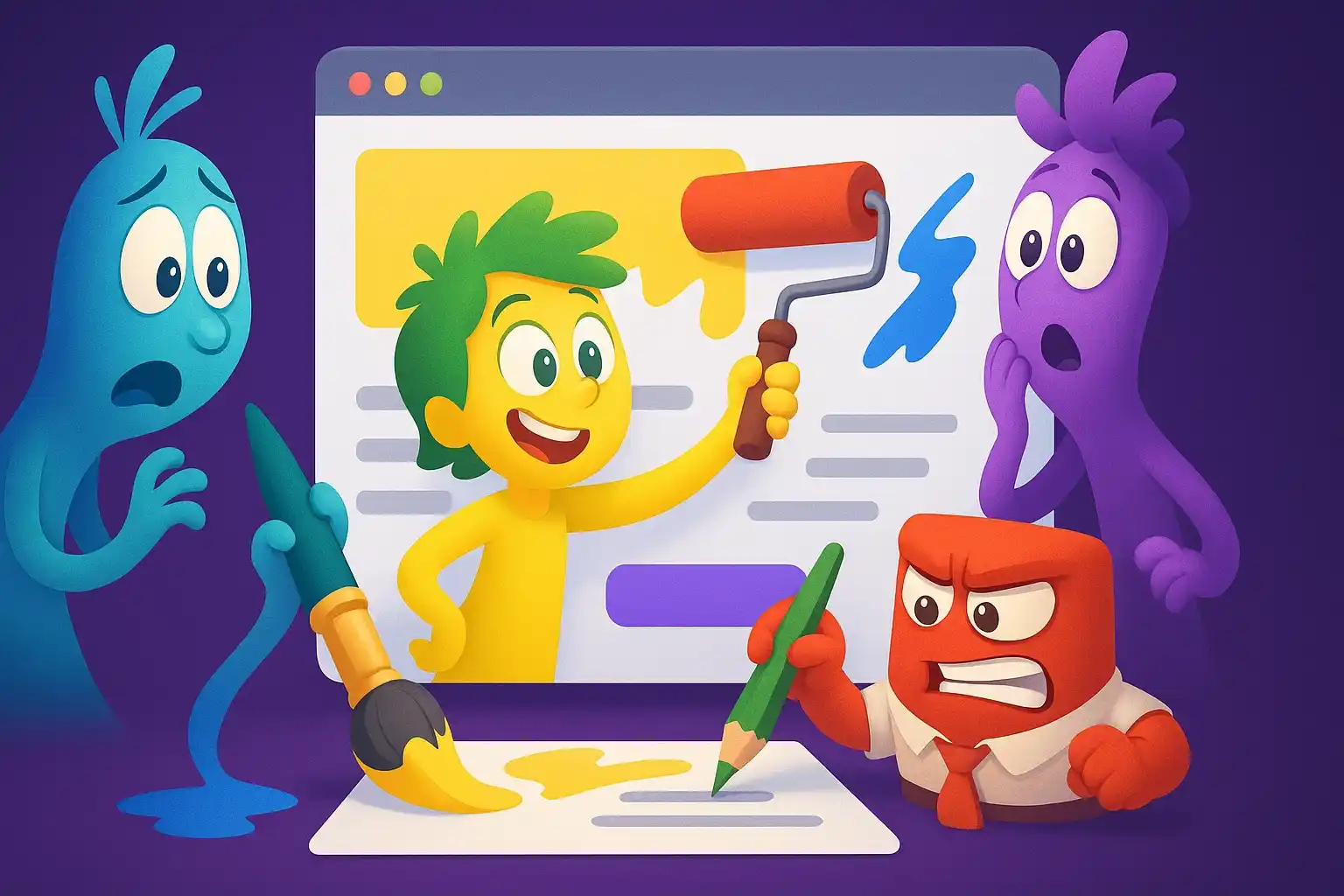
Have you ever built a perfectly functional site, with clean, solid code, but still tried a feeling of unease when looking at it?
A strange sensation, as if something was not in its place, without immediately understanding where?
You're not alone.
Every day so many developers face this frustration: the logic is flawless, yet the end result screams “amateur” from every visual detail.
It's a problem that eats away at confidence, because you know you've done a technically sound job, but something is beyond your control.
The truth is that you are fighting on two fronts without realizing it.
On the one hand there is functionality, your kingdom, where variables obey and loops do their thing.
On the other hand there is visual perception, with different and implacable rules, where choices of layout, colors and spacing they can convey anxiety instead of confidence.
This level is unforgiving: users will never see your clean code, but they will immediately sense if your interface communicates competence or approximation.
And while you focus on logic, every graphic element is telling something about you and your professionalism, whether you want it to or not.
The problem is that no one has ever taught us that every visual element is a message:
- The use of overly saturated colors communicates design uncertainty and a lack of visual competence.
- Rough management of white space reveals superficiality and little attention to user experience.
- An incorrectly calibrated contrast demonstrates the absence of real consideration for the needs of those who will use the site.
He thinks he can finally check this aspect too: to open the browser and see not only a site that works, but an interface that breathes authority, that conquers with its visual impact and reveals in every detail the design intention of those who built it.
But if you think that choosing pretty colors is enough to transform everything, you are completely wrong, because the real power hides much deeper, where every design choice becomes an invisible strategy.
The CSS that makes the difference between an amateur site and a professional one

Remember the last time you opened a project from six months ago and thought "who the hell wrote this CSS code"?
Only to realize, with a mixture of embarrassment and anger, that that "who" was you.
It's that feeling of self-betrayal that hits you when you realize that your CSS looks more like a battlefield than an organized system.
Rules scattered everywhere, specifics that fight each other, media queries that contradict each other, and that "fix-urgent" class that was supposed to be temporary but It's still there months later.
It's not just clutter, it's a symptom of something deeper: you never really learned how to think in CSS.
The problem is not your technical expertise, but the fact that CSS works according to completely different logic from any other language you know.
It is not procedural, rigidly structured and does not follow predictable patterns like some programming languages.
CSS is a declarative language who lives on:
- waterfall
- specificity
- context
three concepts that no one has ever really explained to you.
While you try to control them as you would a function, they behave like natural forces: influencing each other, overlapping, neutralizing each other in ways that seem magical until you understand the profound rules that govern them.
A professional he does not fight against these forces, rides them.
It knows that every selector has weight, that every rule has precedence, that every style has a precise place in the rendering hierarchy.
The difference between amateur and professional CSS can be seen in the details that seem invisible but which the brain perceives instantly.
The professional chooses names that tell a story: they are not simple classes, but fragments of architecture that clearly reveal their function, the relationships they weave and the context in which they come to life.
Its values follow precise mathematical scales, which create visual rhythm.
Its colors are not chosen "because they look good", but calculated to guarantee contrast, readability and harmony in every possible combination.
You can start this transformation today, with just one rule: Every time you write a new CSS rule, stop and ask yourself "where will this rule live in six months?".
If you can't answer, probably you're about to make the same mistake that brought you to the current chaos.
Start documenting your choices, not just what you do but why you do it.
- Create a naming system that your future self can decipher without going crazy.
- Treat style sheets with the same care as more important code, because that's exactly what they are.
- Always ask yourself where that rule will live in six months before you write it.
But organizing CSS is just the beginning.
The real leap in quality comes when you understand that you're not just writing rules, you're orchestrating emotions.
If opening up your old CSS makes you want to change careers, it's not your fault.
It's the fault of an approach that no one has ever taught you how to really design.
Don't wait for the next customer to point out that "something doesn't add up" before the page even loads.
You already have the technique, now you need control.
Visual style: how to guide emotions without words
Have you ever noticed how some sites make you feel immediately at ease, while others make you uncomfortable for no apparent reason?
It's not magic, It's neuroscience applied through CSS.
Your brain processes visual information 60,000 times faster than text, and in those first milliseconds of loading it's already deciding whether to trust or run away.
That feeling of annoyance you feel in front of certain sites is not an aesthetic whim, it's your nervous system that detects inconsistencies, disproportions, disharmonies that scream "danger" on a subconscious level.
It's terrifying to think that all of your work can be judged and discarded in a split second, before the user even reads a single word.
The truth no one ever told you is that every element of your CSS is manipulating specific emotional states, whether you're aware of it or not.
An edge that is too thick communicates aggression, excessive white space conveys emptiness and abandonment, insufficient contrast whispers of insecurity and approximation, and overly saturated colors attack the nervous system while dull ones depress it: every visual choice speaks, even when we don't realize it.
You're not just "decorating" your code, you're programming precise emotional reactions.
A professional knows that blue, with its shades, induces calm and trust and is therefore dominant in the financial sector, that red accelerates the pulse and pushes action, making it perfect for calls-to-action, and that rounded corners evoke security and accessibility, while sharp ones convey precision and control.
Nothing is chosen at random: everything speaks to the mind even before the eyes.
This power becomes even more subtle when you understand gestalt psychology applied to web design.
Your brain constantly searches for patterns, symmetries, proportions that reassure it of the stability of what it is observing.
The rule of thirds isn't an artistic quirk, it's the way your visual system naturally organizes information.
The typographical hierarchy is not a matter of beauty, it is the path that guides the eye to follow to process the contents in the order you want.
When your margins follow precise mathematical progressions, the brain relaxes its defenses because it recognizes a higher order, even if the user does not consciously notice it.
The transition from theory to practice is simpler than you imagine, but it requires a radical change of perspective.
Instead of asking yourself "how do I make this button cuter?", start asking yourself "what emotion do I want this button to trigger?".
Here's how visual design can become a strategic tool to evoke precise emotions and guide user behavior:
- Do you want urgency? Use saturated red, sharp corners, high contrast.
- Do you want trust? Opt for deep blues, soft edges, subtle shadows that give depth.
- Do you want elegance? Generous spaces, minimal typography, desaturated colors that don't compete for attention.
Every choice must be justified by the emotional effect you are looking for, not by the fashion of the moment.
But be careful: master the emotional impact of CSS it's just the first level.
The real control comes when you figure out how to create consistent systems that always work.
The 3 secrets to a coherent design without going crazy

How many times have you looked at your project and felt like each page was designed by a different person?
Headers that change size without logic, buttons that seem to belong to parallel universes, colors that multiply like viruses until they transform your site into a psychedelic carnival.
It's not just an aesthetic issue, it's the visible manifestation of chaos that reigns in your style sheets.
Every architectural compromise you justify with 'it's only this time' is a step towards chaos that will turn your elegant system into a labyrinth of special cases.
It's like watching a chemistry experiment get out of hand: You know you were supposed to follow a precise formula, but now you can't remember which ingredients you already added.
The first secret that distinguishes professionals from improvisers is the design token system.
It's not about using random CSS variables, it's about creating a mathematically coherent visual language that governs every aesthetic decision.
Imagine having only five possible dimensions for all your spaces; Does it seem limiting?
It's exactly the opposite.
These constraints they free you from anxiety of infinite choice and guarantee that each element coexists in harmony with the others.
The same principle applies to colors: not three hundred shades of blue that hate each other, but a precise palette of primaries, secondaries and neutrals that you can combine infinitely without ever obtaining disastrous results.
Typography follows the same logic: a modular scale that starts from a base and develops according to fixed mathematical ratios.
The second secret is the system of atomic components, and here the chemical metaphor becomes literal.
Just as atoms combine to form molecules and molecules form organisms, your CSS elements they must follow a hierarchyv rigid composition.
A button is not just a button, it is an atom that can exist in precise variants: primary, secondary, ghost, danger.
A card is not a generic container, but an organism composed of specific atoms (header, body, actions) that maintain their properties in any context.
When you need something new, you don't write CSS from scratch: compose existing atoms or create controlled variants of consolidated bodies.
The third secret, the one that few really know, is the principle of progressive disclosure applied to CSS.
Your stylesheets need to tell a story that goes from the general to the particular, from global to local.
First you define the basic system, i.e. reset, global typography and color system, then you build the shared patterns such as layout, grids and utility classes, and only at the end you deal with the specificities of the individual components.
This hierarchy is not just organizational, it is functional: each level can overwrite the previous one predictably, without unexpected side effects.
The transformation begins the moment you stop thinking of your CSS as decoration and start treating it as an operating system for the visual experience.
Document your choices as you would an API, create living style guides that update automatically, and test visual consistency as rigorously as you would check business logic.
Your future self will thank you when it can add new features without fear of breaking the existing balance.
But even the most elegant system can collapse if you don't know how to avoid the most common pitfalls that turn hours of work into endless frustration.
How to avoid wasting hours on nothing

It's Friday night, eight o'clock, and you're still there struggling with a lineup that was supposed to take five minutes.
You've tried flexbox, grid, absolute positioning, even some float hacks you thought you'd forgotten forever.
Your CSS has become a cemetery of commented properties, desperate attempts, !important scattered like cries for help.
That one feeling of helplessness rising from your stomach as you watch hours of work dissolve into a seemingly insignificant detail.
It's not just technical frustration, it's the anger towards yourself that comes from knowing that it exists somewhere an elegant solution that escapes you, while you continue to waste precious time with workarounds that reek of desperation.
The real problem is not the complexity of CSS, but the fact that most developers approach each challenge as if it were unique and unrepeatable.
They spend hours reinventing solutions to problems that have already been solved thousands of times, because no one has ever taught them to recognize recurring patterns.
That "impossible" layout that's driving you crazy is probably a variant of one of the twelve layout archetypes that every interface uses:
- Header-content-footer: the most classic layout: a header at the top, central contents and a footer at the bottom.It offers structure, predictability and visual order.
- Sidebar navigation: sidebar (often on the left) used for persistent navigation.Ideal for dashboards, restricted areas or complex apps.
- Card grid: contents arranged in "cards" placed side by side on a grid.Each card is autonomous and represents an element (product, post, option).
- Hero section: A dominant visual block, often at the top of a page.Use images, headlines, and CTAs to grab attention and communicate value.
- Form layout: structure designed to facilitate filling out forms.Align labels, fields and buttons for clarity and speed of use.
- Dashboard tiles: visual boxes (or "tiles") that summarize key information: graphs, data, quick actions.Perfect for quick checks.
- Split screen: the page is divided into two parallel sections.Used for comparisons, duality of content or interactive onboarding (e.g. image + text).
- Tabbed interface: contents organized into selectable tabs.Useful for saving space and separating logically connected sections.
- Modal/dialog overlay: window that overlays the main content.It is used for confirmations, quick inputs or temporary focuses without leaving the page.
- Step-by-step wizard: step-by-step wizard interface.Perfect for complex processes (e.g. registration, purchase, onboarding) that require subdivision.
- Masonry layout: asymmetric grid where elements adapt based on height.Often used in visual galleries, portfolios or blogs.
- Media list (image + text list): Each row shows an image next to some text.It is the typical format for ordered lists (e.g. news, playlists, notifications).
Each of these patterns has a consolidated, tested, documented optimal solution.
But instead of starting from these fundamentals, every time you start from scratch, as if it were the first time someone faced the problem of vertically centering an element or creating a responsive grid.
The solution is brutally simple but requires humility: stop improvising and start building your own library of proven patterns.
I'm not talking about copy-pasting random code from online platforms, but to create an arsenal of solutions that you know intimately, which you have tested in every possible scenario, which you can recall and adapt in minutes instead of rebuilding every time.
A professional knows that perfect centering is achieved with display: grid; place-items: center for simple cases, with flexbox for more complex situations, with positioning only when absolute control is needed.
He doesn't experiment every time, apply the most appropriate solution to the specific context.
The way out of the endless loop of frustration begins with an audit of your CSS debugging habits.
Whenever you find yourself wasting more than twenty minutes on a layout problem, stop and analyze what's really going on.
Use browser tools to view the box model, activate CSS grids, color margins and paddings to see what's taking up space where it shouldn't.
Most of the CSS problems are comprehension problems of the rendering flow, not knowledge of the properties.
Learn to read code as the browser reads it: from top to bottom, considering cascade, specificity, and inheritance in every step.
The turning point comes when you realize that your time is worth more than your ego.
Instead of persisting on "elegant" solutions that are wasting hours, temporarily adopt functional workarounds and document the problem to calmly solve it later.
Create specific tasks for refactoring and optimization, treat them with the same priority you would give to security bugs.
The perfect code it is the enemy of working code, and code that works today is infinitely more valuable than perfect code that never arrives.
But be careful: even when you have solved the problem of wasted time, an even more subtle challenge remains that can sabotage all your work.
If you find yourself struggling for hours on a layout that was supposed to take five minutes, maybe the problem isn't that div.
It's just that you've never had a stable, ready-made library of your own.
Every time you start from scratch.
And every time you waste time, patience and money.
Do you really want to do the next one all over again?
The difference between theme and visual identity

Have you ever heard a customer say "I like that style, let's do the same" indicating a site completely different from their business?
Or worse yet, of find yourself copying design components that work perfectly on other projects but in your context seem forced, unnatural, wrong?
It's that alienating feeling of having dressed your project in someone else's clothes: technically everything works, but there's something deeply dissonant that you can't put into focus.
The problem is that you are confusing theme with visual identity, and this confusion is leading you to create masks instead of authentic faces.
While you think you have solved the design problem, in reality you have only applied a superficial paint that betrays the true nature of the project.
The difference between theme and visual identity is the same as between a carnival costume and your DNA. A theme is a set of aesthetic choices that can be applied to any content: colors, fonts, spacing, visual effects that you can download, customize and apply like a protective film.
It works, it's fast, it solves immediate presentation problems.
But visual identity is something completely different: it is the authentic expression of the personality, values and unique character of a project through design choices that arise from its specific essence.
When you see an innovative fintech startup site that uses the same visual elements as a grandma's recipe blog, you're looking at a theme applied without an identity.
But when every visual element consistently tells the same story, from typography to white space, from animations to micro-feedback, you're looking at an authentic visual identity.
The process of developing true visual identity begins long before opening the CSS, and requires a type of analysis that most developers consider "too creative" for their skills.
But you're wrong: it is pure logic applied to emotion.
You have to ask yourself who your project really is if it were a person: young rebel or mature professional?
Accessible and reassuring or exclusive and sophisticated?
Innovative and experimental or solid and reliable?
Each answer translates into precise CSS choices: an innovative company will use fluid animations and surprising transitions, a traditional bank will prefer static and sobriety.
A youthful brand can afford saturated colors and bold typography, a luxury service requires refined palettes and elegant fonts with plenty of space to breathe.
The transformation from theme-applicator to identity-designer requires a radical change in methodology.
Instead of starting from "what colors will I use?", ask yourself "what emotions should I convey?", and instead of asking yourself "what font is in fashion?", think about "what personality should the voice of this project have?".
Then create mood boards that capture the emotional essence even before the technical details and study how the brands you admire transform their values into concrete visual choices.
Analyze why certain color schemes work for Netflix but would be disastrous for a medical clinic.
Documenting these decisions is important: every choice must have a justification that goes beyond "I like it that way".
The moment you know you've found the true visual identity of your project is when every new element you add seems natural, inevitable, as if it couldn't be different.
You are no longer applying external rules, you are expressing an internal logic that is self-sustaining and self-replicating in every detail.
But also the strongest identity can fail if you fall into the most dangerous trap that afflicts 90% of web projects.
Because stylesheets are more marketing than technique

How many times have you heard "design isn't important, as long as it works"?
You probably thought so too, focused as you were on the flawless logic of your backend, on the elegance of your queries, on the robustness of your architecture.
But then comes the moment of truth: you present your work and see that micro-expression of disappointment on the customer's face, that embarrassed silence before the "yes, it works well, but...".
That's when you realize you built a hypercar with the body of a small car, and that all your technical effort risks being nullified by an amateur visual perception.
It's not unfair, it's simply how the human brain works: judge before reasoning, he feels before understanding, he decides before analyzing.
What no one ever told you is that your stylesheets are the most powerful marketing department you have at your disposal, and probably the only one most users will ever actually see.
While you have spent weeks optimizing performance that is measured in milliseconds, the user he's deciding whether to trust of your product based on visual details that it evaluates in a few microseconds.
A button with pixelated edges communicates that the developer doesn't know what he's doing, poorly calibrated white space whispers that no one has thought about user experience and an overly aggressive background color screams that the service is unreliable: every visual detail speaks, and it does so louder than you think.
Every pixel of your CSS is doing marketing, positive or negative, whether you want it or not.
The difference is that traditional marketing tries to convince with words, while your design convinces or repels on a subconscious level, before the user even reads a single line of text.
This hidden power is amplified when you understand that you're not just selling features, you're selling a feeling of control and competence.
A user who finds himself in front of a clean, coherent and predictable interface immediately feels safer and more at ease control of the situation.
On the contrary, a chaotic or neglected interface makes him feel stupid, anxious, at the mercy of something he cannot decipher.
It's not a question of aesthetic vanity, it's psychology applied through code.
When everything follows a precise mathematical logic, the user subconsciously perceives order and reliability.
When your colors respect the principles of accessibility and contrast, the user feels respected and considered, and when your animations are smooth and meaningful, you feel quality, care, and attention to detail in every single interaction.
The transition from developer-who-also-does-design to marketer-who-uses-CSS requires a radical change of perspective.
Start thinking about each element of your visual design as a touchpoint that it can strengthen or weaken perception of your identity.
That loading isn't just technical feedback, that error message isn't just exception handling, and that transition between pages isn't just navigation: each of these moments is an opportunity to convey personality, empathy, and care, making the experience more human and coherent.
The transformation is complete when you realize that your most powerful CSS is not the one that implements complex functionality, but the one that makes the user feel smarter and more satisfied with themselves.
At that moment you're doing marketing higher level: you're not selling your product, you're selling a better version of the user.
But there's one devastating mistake that can undo all this work, and almost everyone falls for it without even realizing it.
Every button out of place, every wrong white space, every inconsistent detail is telling your user that they can't trust you.
And while you defend the code, he leaves in silence.
Your CSS today isn't just working or not, it's doing marketing for you.
If you don't have control over it, you're losing much more than a few pixels.
Clear styles, happy customers: it's not just aesthetics
Have you ever worked on a project that seemed to get complicated from the start?
The customer constantly changes their mind, the changes pile up and every meeting becomes a chore.
It seems to be the fault of the communication or the customer himself.
But often the problem is simpler and less visible: disorganized CSS that creates confusion and fuels misunderstandings from the first steps.
When a customer sees inconsistent interfaces, elements that behave differently from page to page, details that change without apparent logic, their brain registers only one thing: "they don't know what they are doing".
And from that moment on, every proposal you make will be viewed with suspicion, every technical decision you make will be questioned, every deadline will be considered uncertain.
The connection between clean CSS and customer trust isn't mystical, it's pure neurobiology.
The human brain is programmed to recognize patterns and consistency as indicators of competence and trustworthiness.
When your style sheets follow precise logic, when each element has its established place in an organized system, when your design choices are justifiable and replicable, you are communicating control and professionalism at a level that bypasses reason entirely.
The client doesn't know what CSS specificity is or why you chose flexbox instead of grid, but his nervous system perceives the underlying order and relaxes.
On the contrary, when your CSS is a patchwork of improvised solutions, when styles contradict each other, when each page seems to have different rules, you're conveying chaos and improvisation.
The client begins to doubt not only your design skills, but your ability to manage the complexity of the entire project.
This dynamic amplifies over time because disorganized CSS generates concrete consequences that the customer sees and experiences directly.
Seemingly simple changes are transformed into hours of work to untangle unexpected dependencies, new features compromise already working layouts in inexplicable ways, tests on different devices reveal inconsistent behavior that requires point fixes rather than structured solutions.
For the customer, every anomaly becomes confirmation of his doubts, every delay a silent proof of your inadequacy.
The customer only sees that things break often and repairs take an unpredictable amount of time.
The turning point in customer management begins when you realize that your CSS is not just code, it is the language through which you communicate competence and reliability.
Start every project with an explicit design system definition phase, even if the client thinks they don't need it.
Create a living style guide that documents every choice and its logic.
Show the customer how each element is part of a coherent ecosystem, how each change respects pre-established rules instead of being improvised.
When presenting mockups or prototypes, explain what problem it solves, how it integrates into the overall system.
Transform the customer from an external judge to a collaborator who understands the logic of your decisions.
The magic moment comes when the customer starts saying "ah, I understand" instead of "but you could also try...".
When his change requests become more targeted because he has understood the structure of the system, ed start trusting your choices even without fully grasping them, because he recognizes in them a coherence that goes beyond the visible detail.
That's when you're no longer selling development hours, you're selling peace of mind and control.
But all these efforts can collapse in an instant if you don't understand how visual clutter destroys the value of the content itself...
The visual order that gives value to the content

Have you ever read a brilliant article on a site with terrible design and come away feeling like the content wasn't all that interesting?
Or on the contrary, to find yourself completely absorbed by a mediocre text presented with an impeccable layout?
This is the hidden power of visual hierarchy that it can make banal content seem brilliant or completely ruin a revolutionary idea.
Your brain never reads just the words, it always reads the whole: dimensions, spaces, contrasts, visual rhythm, balance.
When these elements are in conflict or poorly orchestrated, they create background noise that pollutes understanding, distracts attention, it makes even the most crystalline thought seem confusing.
It's terrifying to realize that years of work on quality content can be undone by bad margins or typography that fights instead of supporting the message.
The problem is that most developers treat design as decoration added to the content, when in reality the design is the content.
Every little part of your CSS is declaring the relative importance of each element, it's leading the eye through a specific path, it's creating pauses and accelerations in the reading pace.
A larger font size doesn't just say “read me first,” it says “this it is more important than everything else".
Generous white space isn't just "air to breathe," it's a statement of value: "this content is so valuable that it deserves all this space."
A different background color is not just aesthetic variation, it is cognitive categorization: "this type of information is different from that one".
When these signals are inconsistent or contradictory, the reader gets lost not in the content but in its presentation, and ends up judging the information as confused even when it isn't.
This power manifests itself even more subtly through what neuroscientists call “cognitive load”: the amount of mental energy required to process information.
A well-designed layout dramatically reduces this load because the brain doesn't have to spend energy deciphering the visual organization, it can focus entirely on the meaning.
On the contrary, a chaotic design forces the reader to do double work: first understand how the information is organized, then process the information itself.
It's like asking someone to solve a math problem while listening to loud music: technically possible, but much more effort and with worse results.
A professional knows that typography is never neutral: serif to convey authority and tradition, sans-serif for modernity and clarity, mono-space for technical precision.
He knows that the length of the lines influences the reading speed: too short create anxiety, too long tire the eye.
He knows that the contrast between adjacent elements determines the order of perception.
The transformation begins when you stop asking yourself “how do I make this text beautiful?” and you start to ask yourself “how can I make this content seem smarter than it is?”.
Here are four handy tools to make content seem smarter and more engaging:
- Use size to create visual hierarchy: titles that dominate, subtitles that lead, text that flows without resistance.
- Use color to categorize: each type of information has its own tone, each level of importance has its own saturation.
- Control the white space like an orchestra conductor controls the pauses: where you put silence determines how loudly what comes next resonates.
- Create rhythm through repetition: patterns that reassure the eye and allow the brain to focus on the content.
The turning point comes when you realize that your best content, presented with mediocre design, will always perform worse than mediocre content presented with excellent design.
It's not injustice, it's how human perception works.
Your job is not just to make information accessible, but to make it irresistible.
And now that you have all the pieces of the puzzle, it's time to figure out how to turn this knowledge into a competitive advantage that will forever change the way you work and how you are perceived in the market.
If you've made it this far, you probably already know: the problem isn't the code.
It's not even the client, the browser or the deadline.
The problem is that no one has ever shown you how to really master that invisible part of your job that affects everything, even when you think you did everything right.
CSS is not just syntax.
It's reputation.
It's perception.
It's trust.
It's what your customer sees before your talent.
It's what your user hear before reading one line.
If you're tired of justifying yourself, of chasing absurd changes, of losing customers for details that don't even seem like your fault, maybe it's time to change your approach.
To stop being just “that good at making things work” and start becoming the one they rely on without asking why.
And no, you don't need to reinvent yourself: you need to rewrite how you work.
Let's talk about it.
Just leave your details.
You'll see the rest happen.
Leave your details in the form below